Once your wedding date is announced and planning begins in earnest, you’ll frequently get asked one question many times – What are your wedding colors?
The question may be common, but can elicit stressful feelings. Your overall wedding design hinges on choosing the perfect color scheme.
But don’t stress. We have your step-by-step guide on how to choose your wedding colors.
Start with the Venue
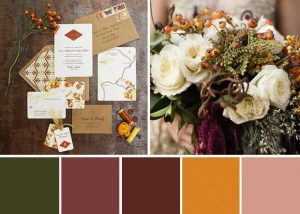
You may have already started collecting Pinterest pins long before your actual engagement. But don’t get too far ahead.
Once you’ve selected your wedding date, the next step is to find the right wedding venue for your reception.
Having an idea of the overall feel and mood of your wedding will help you as you begin your wedding venue search. But don’t finalize your color palette just yet. This way you won’t spend too much time or energy creating a color scheme that you’ll end up having to abandon
Some wedding reception venues offer a neutral, blank canvas. Outdoor gardens, simple wooden barns and empty art museums can absorb many different color palettes.
But if you’re planning a wedding in a historic ballroom with rich, red velvet curtains and dark wood paneling, a subtle springtime palette may feel jarring in the room.
At the same time, don’t be overly concerned with matching a room directly. If the country club you’ve selected has tan and green carpet, that doesn’t mean you’ll want to use those colors in your final selections. Overly matching your wedding decor with your reception space can be visually overwhelming.
You can also add interesting elements to the room through wedding decor items such as floral walls. These items can less-appealing areas or enhance your design. Use a reputable floral wall design company such as Palisades Designs for best results.
Ultimately, having the right wedding decorator or wedding planner will help you create a cohesive overall look.
Think Palette, Not Colors
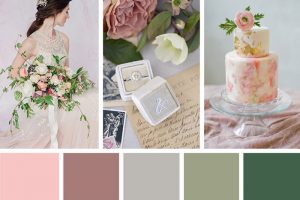
Wedding decor has evolved quite a bit over time. Couples no longer choose only two wedding colors and match every linen, flower and gown to those two colors (thank goodness!).
For a truly beautiful and unique wedding, you’ll want to consider a color scheme.
Start with a single color that is calling your name. Maybe you’ve just bought a pair of shoes or clutch in a color that inspires you. Or your home shows an affection for dark blues. Pull away from the computer and instead visit a home decor store to get color inspiration in person.
Once you have a color chosen, consider adding a metallic that works with your first choice. Look through paint or linen swatches to see how the colors feel alongside each other. Gunmetal Gray evokes a very different vibe when paired with burgundy than it does than say, a blush pink.
Add a third color to bring your color palette to life. Try using a color wheel to experiment with different combinations. Whether you pair complementary colors or contrasting colors will change the mood evoked.
A neutral color can round out your overall palette. Fall palettes can be warmed up with a deep, dark brown. A spring color scheme can be balanced with a dusky tan.
All of these color elements will be brought together in your reception decor. This may be with beautiful lounge furniture from companies such as Top the Occasion, colorful tableware from Premiere Events or linens from American Party Rental.
Seasons Matter…Sort Of
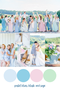
An important aspect of choosing your wedding colors is considering the season your wedding is held.
There are certain colors that naturally evoke each season.
Pale, muted palettes that showcase colors like rose pink, eucalyptus green, and cornflower blue will always look beautiful for a Spring garden wedding. Easter-inspired colors work equally well. Citrusy oranges, pale yellows and lavender purple are all great Spring colors.
Summertime evokes a fun and breezy mood. You can get away with bright pops of yellow, orange and pink throughout your color scheme. Seaside colors like turquoise and seafoam are also great summertime picks.
Deep, succulent colors associated with the season makes Fall weddings versatile in their color palette selections. This is a great time of year to look at nature to get your cues.
Winter weddings are the perfect opportunity for rich jewel tones. Think beyond winterberry red to more modern colors like rich burgundy, sapphire blue and emerald green.
Still, don’t feel obligated to do the expected. A muted pastel palette alongside sparkling metallics can give a winter wedding a hidden wonderland feel. Just as sage green and salmon pink can wake up a dark fall wedding color palette.
Work with an experience florist such as H-E-B Blooms or Robert’s Flower Shop early on to get insight into what florals are available each season that work with your color choices.
Getting Ombre Right
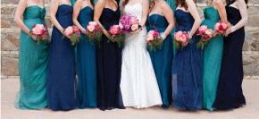
An ombre color palette is a popular choice among wedding couples.
Choose the color you want to go with such as green, blue or purple and use a variety of shades to complete the look.
Play with plenty of texture and consider adding a bright color pop to the ombre color palette to avoid your wedding decor looking flat. Think shades of blue with pops of sunshine yellow, or a purple palette woken up with lime green.
The ombre look is especially charming around Valentine’s Day where you can select a color range from pale pink to vibrant red.
You can extend the effect beyond decor to the wedding fashion choices as well. There are certain tricks to choosing your bridesmaids dresses in this decor style, so think gown choices through carefully. Work with the experienced professionals at MV by Di France to get this look right.
Don’t be Afraid to go Bold
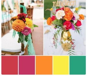
The most memorable wedding decor that will have all your guests talking is a color scheme full of rich, bold colors.
Bright rainbow colors or deep jewel tones are both bold and alluring choices to make your wedding stand out. And for the right daring and sophisticated couple, make the perfect color choice.
For bright colors, stick to the same tone so each one pops on their own as well as blends together. A sea of colors means you’ll want to anchor the palette with a bright white.
For jewel tones, pick two bold colors and build your metallic and neutral colors selections around them. A rich emerald green with marigold yellow, or sapphire blue with ruby red both make daring and sophisticated choices. These can all be anchored with silvers, golds, deep browns or stark whites.
Stay True
With all the color scheme trends, rules, and guidance you may get, stick with what you both love.
Just because a color scheme is trendy, doesn’t mean it’s right for you. The trends never last and if you want a timeless look, think through your color selections carefully. At the same time, just because a color is popular, doesn’t mean you should avoid it. Make it yours with an original overall decor scheme.
Avoid getting pressured into creating someone else’s vision of what your wedding should be. Your wedding colors, just like the rest of your ceremony and reception, should ultimately be a reflection of who you are as a couple.


